Keep the decision’s amount and label readable together
Comfortable reading is part of making a deliberate account decision. On Zora, the lobby, promotion text and embedded game can have different layouts, so one zoom setting may not suit every screen. Check whether the important amount, label and confirmation remain visible together before continuing.
A deliberate action depends on understanding both the value and the control beside it. A large button is not sufficient if its label is unclear or the amount it confirms is hidden. On a phone, inspect the complete decision area before moving on: selected item, price or stake, relevant condition and final confirmation. The lobby and an embedded provider game can behave differently. Readability in one part of the site should not be treated as proof that every account form and game panel is equally usable.
Adjust the view and inspect what changed
Start with the device's text or browser zoom controls where available. Increase readability gradually and inspect the result rather than assuming that a larger setting always improves the page. A fixed button can cover text, and a game canvas may not respond like an ordinary article. Rotate or use a larger screen if the necessary information remains clipped.
Increase text or zoom gradually using the controls available on the device, then check whether content wraps, disappears beneath a fixed element or requires horizontal movement. The useful setting is the one that preserves the relationship between labels and values. An ordinary text page may adapt differently from a game canvas. If the necessary information remains inaccessible, use an alternative orientation or a larger screen before making the decision. Do not reduce text to an unreadable size simply to reveal a confirmation button at the bottom.
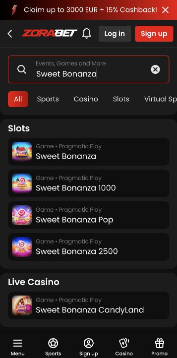
Confirm selection through more than colour
Do not rely on colour alone to distinguish selected and unselected options. Read the label and confirmation, especially for a stake, bonus choice or payment method. If the interface gives no clear indication of what is selected, stop before submission and ask for assistance. This guide does not certify the site's compatibility with every assistive technology.
A selected option should be identifiable from its text, state or confirmation, not only a colour difference that may be difficult to perceive. For a payment method or reward category, reread the named selection in the summary before submission. If the interface supplies no clear indication, that is a practical barrier to resolve rather than a reason to guess. The same applies to a stake control where a highlight changes but the total is unclear. A visible response to a tap is not necessarily an understandable confirmation of its financial effect.
Check the actual task with the intended input method
For screen-reader or keyboard use, verify the specific task before involving money: can you reach the menu, identify the selected field and understand the confirmation? A readable lobby does not prove that every third-party game exposes equivalent controls. Choose an accessible alternative task or device when a required control cannot be identified reliably.
With a screen reader, keyboard or other input method, test the navigation task before involving money. Can the menu be reached, the field identified and the selected value understood? Can the confirmation be distinguished from cancellation? These are task-level questions, not a certification of the whole product. Third-party game interfaces may expose controls differently from the account pages. If a required step cannot be identified reliably, choose a suitable alternative device or seek assistance through the official route instead of confirming an action whose meaning remains uncertain.
Report a specific barrier and its effect
When reporting a barrier, describe the page, control, device and assistive setting, and explain the action that became impossible. A concrete report such as an amount hidden behind a fixed bar is actionable. Enlarging text should help you understand the same information, not pressure you into accepting a condition that remains unreadable.
A useful barrier report names the page, exact control, device, browser and relevant accessibility setting. Explain the blocked task, such as reading the total before a deposit or closing a rules panel without reaching the spin control. Include a focused image if it helps and remove personal details. This is more actionable than saying that the site is inaccessible in general. The objective of an adjustment is to understand the same information clearly, with enough time to decide, rather than to make a hidden condition easier to overlook.